
One Eastside
One Eastside
Rising above the city. Rooted in its soul.
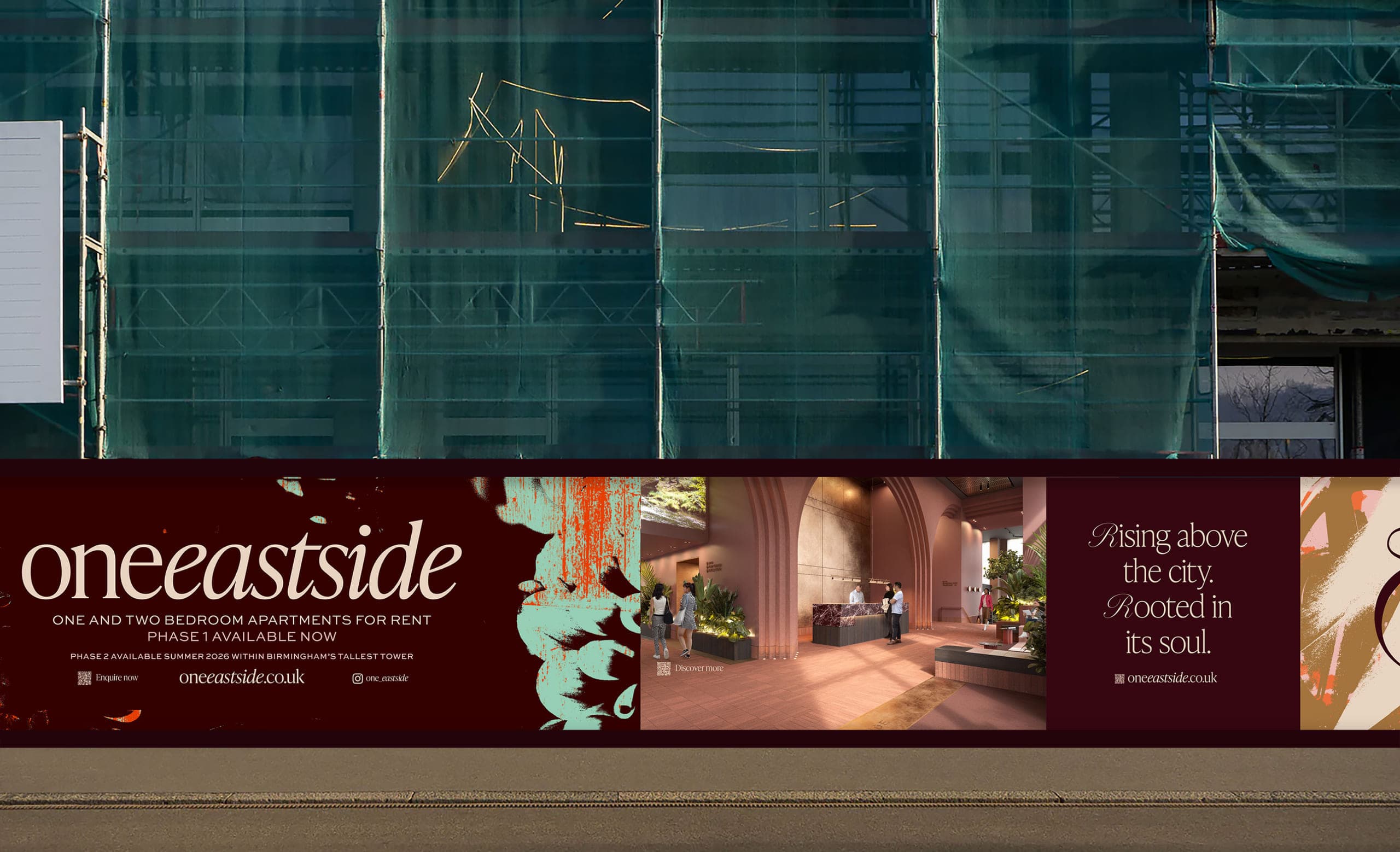
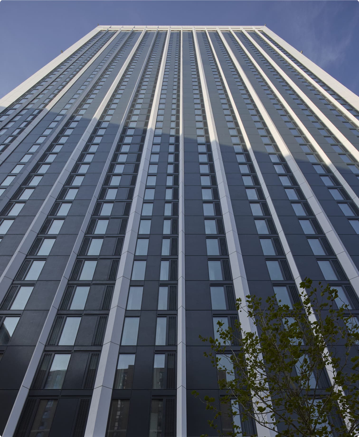
One Eastside makes an unmistakable mark on Birmingham’s skyline. But height alone was never going to set it apart in a city with a thriving build-to-rent market. Rising above the city. Rooted in its soul. became the thought behind the brand: a way to speak both to One Eastside’s physical presence and to a living experience shaped by Birmingham’s character, craft and history.
01.
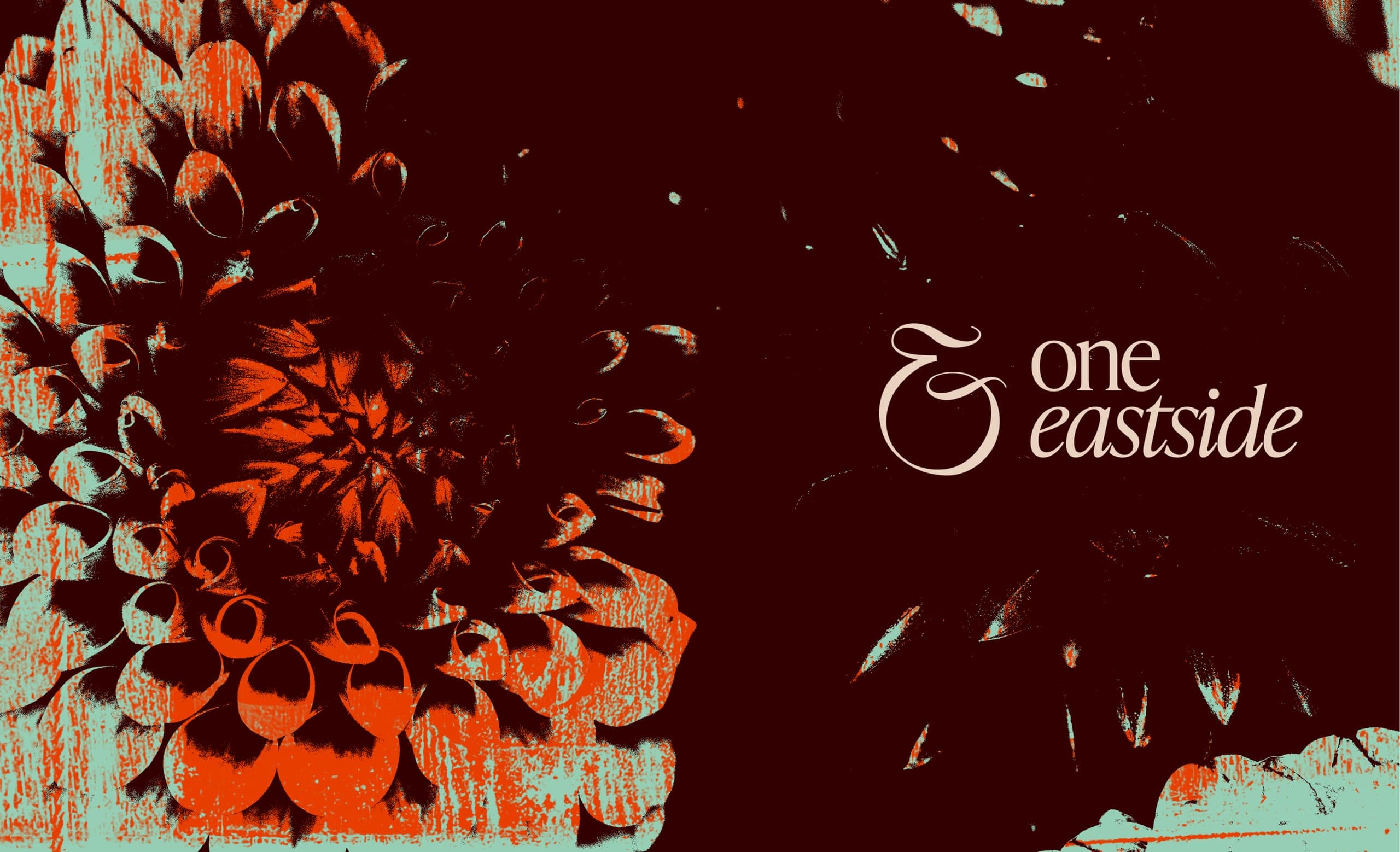
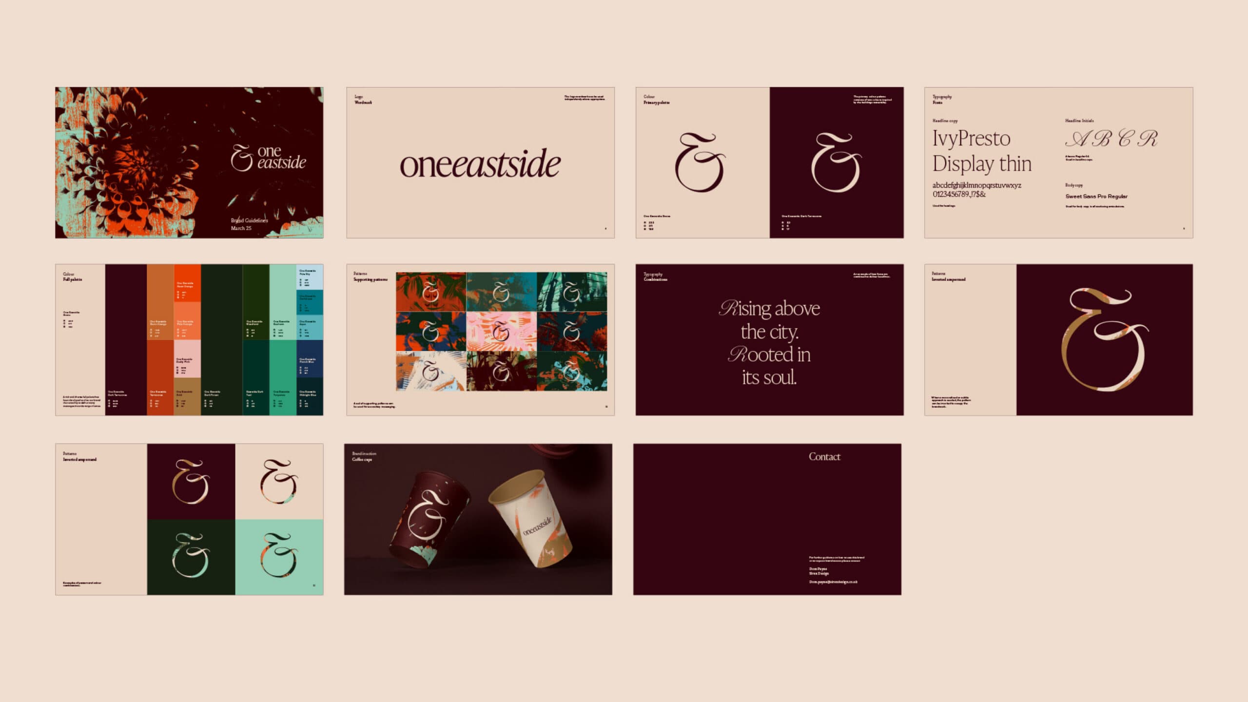
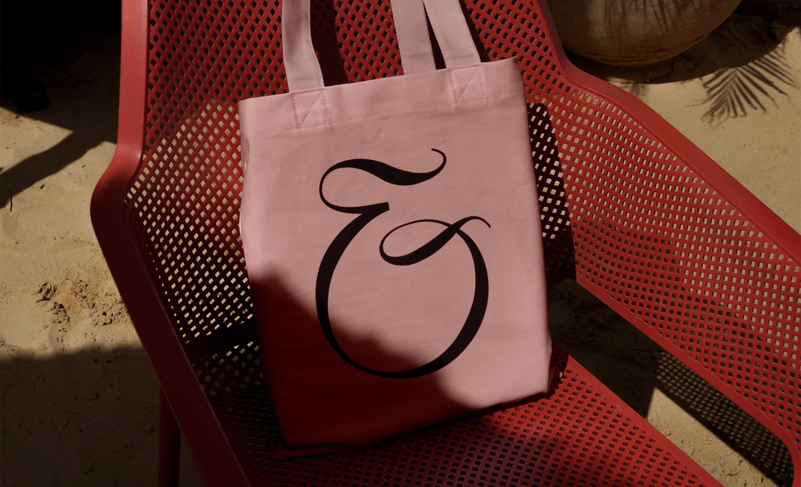
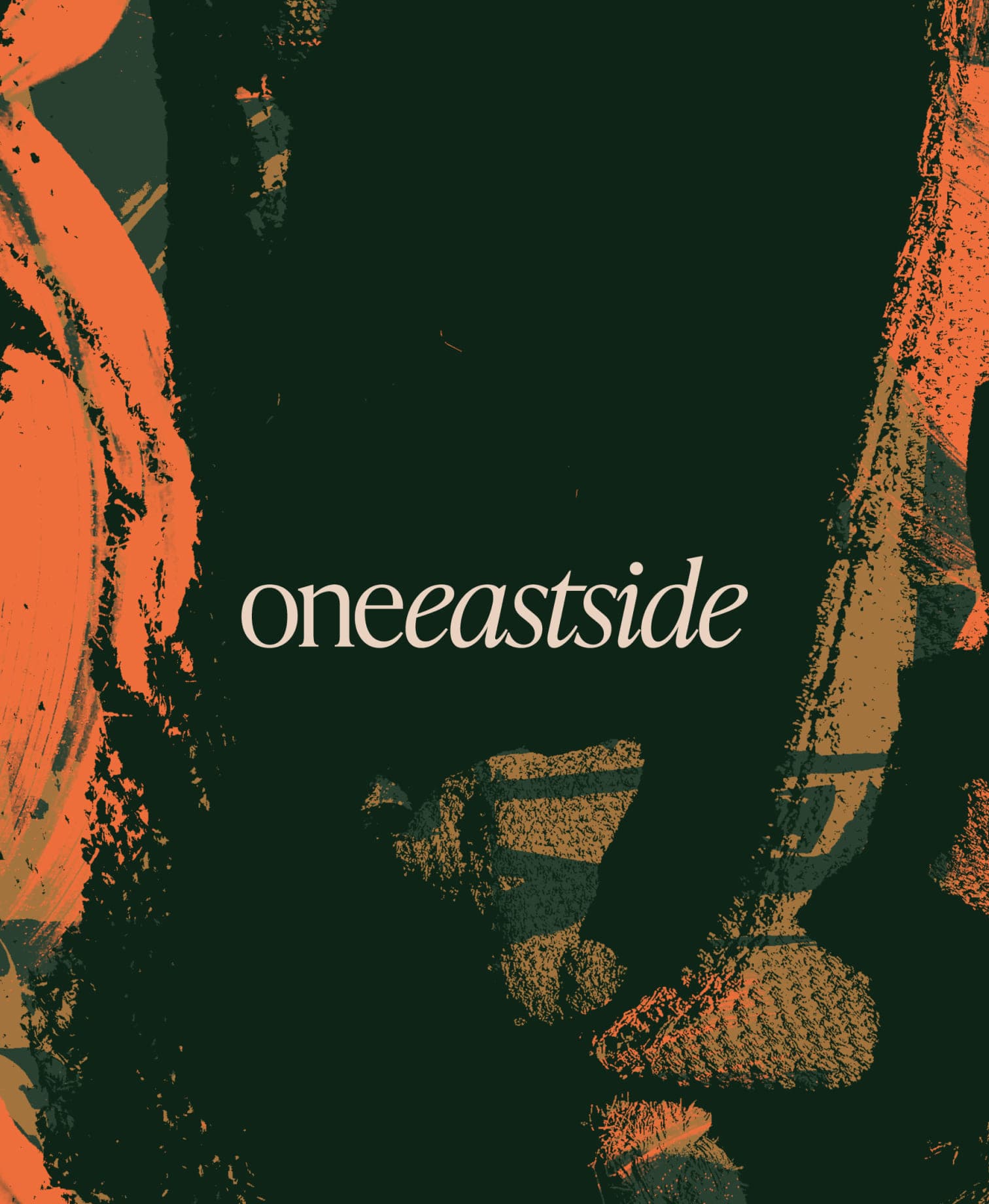
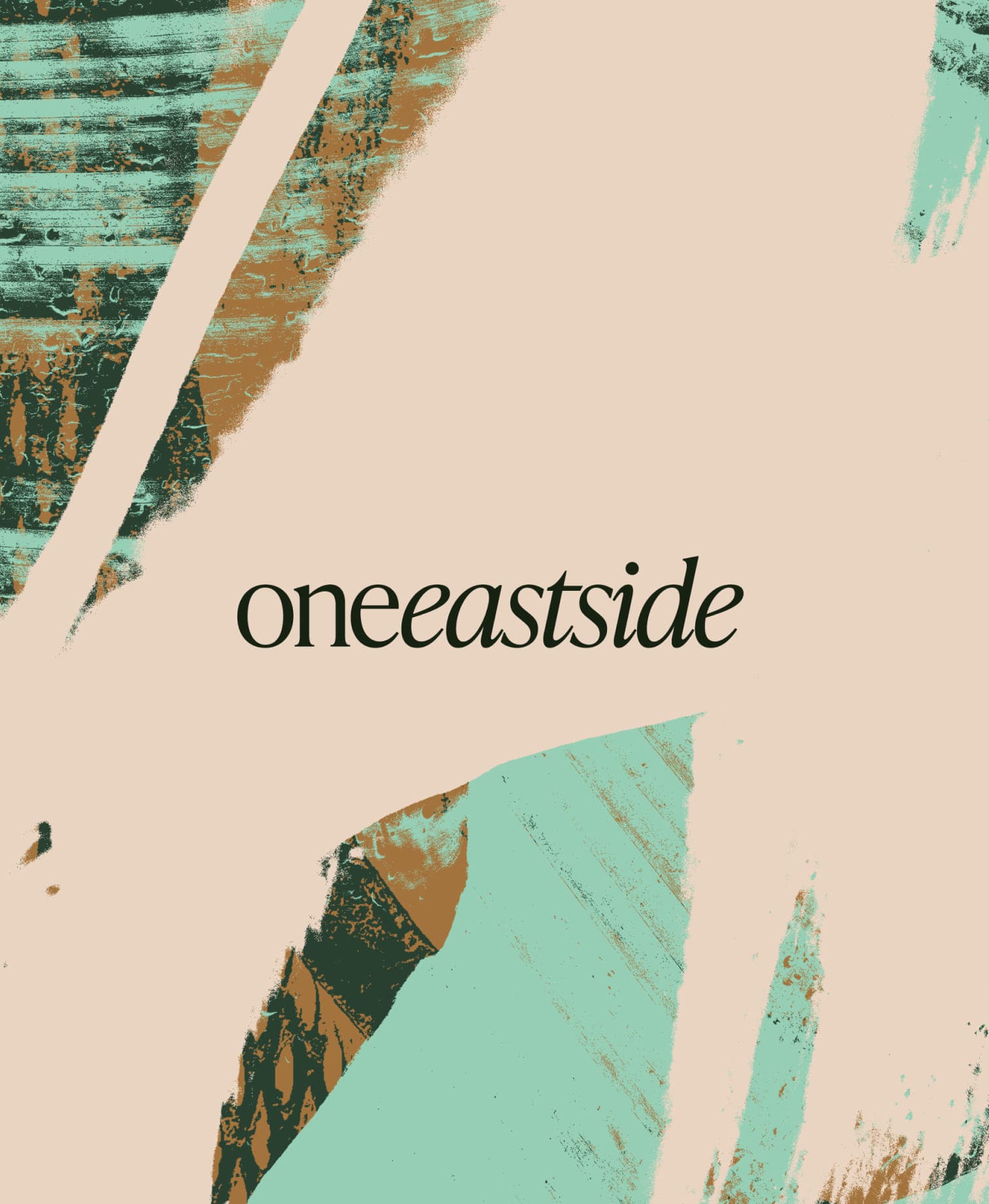
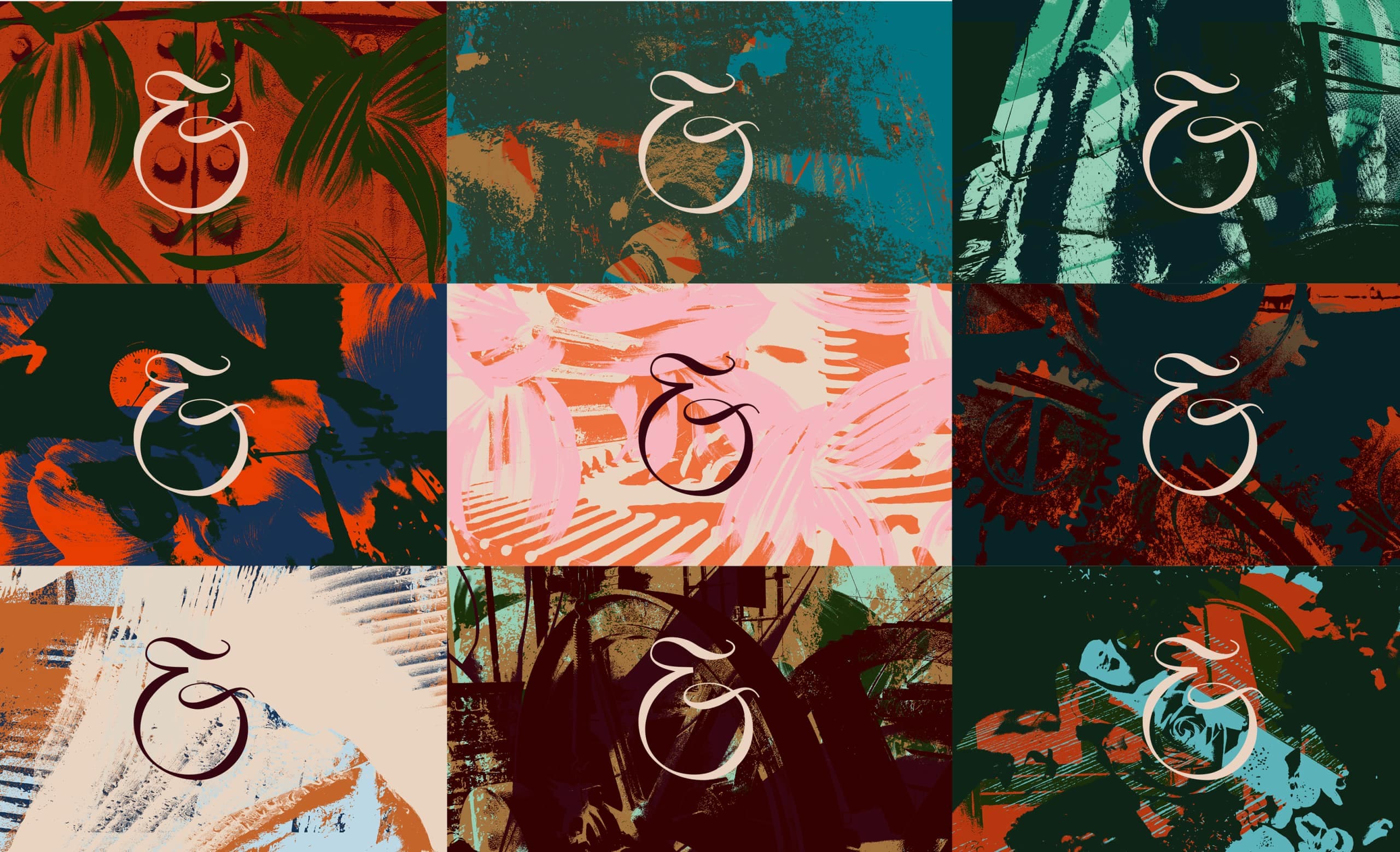
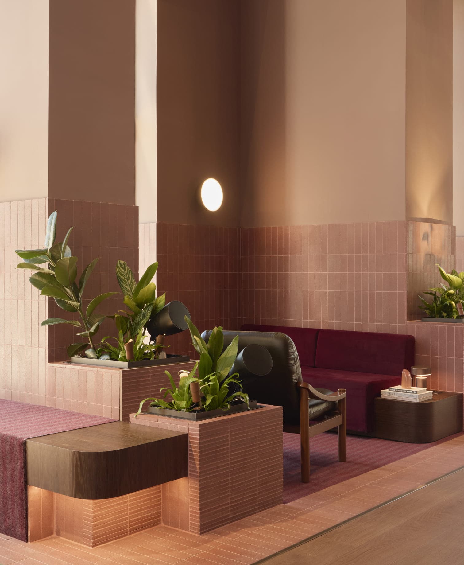
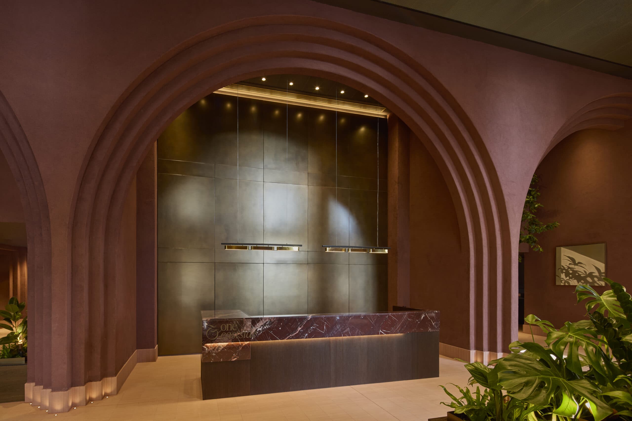
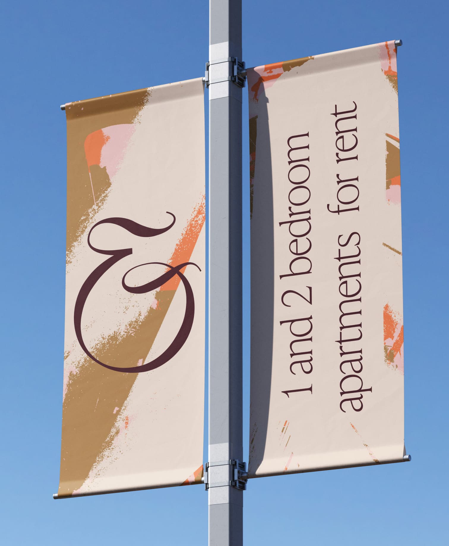
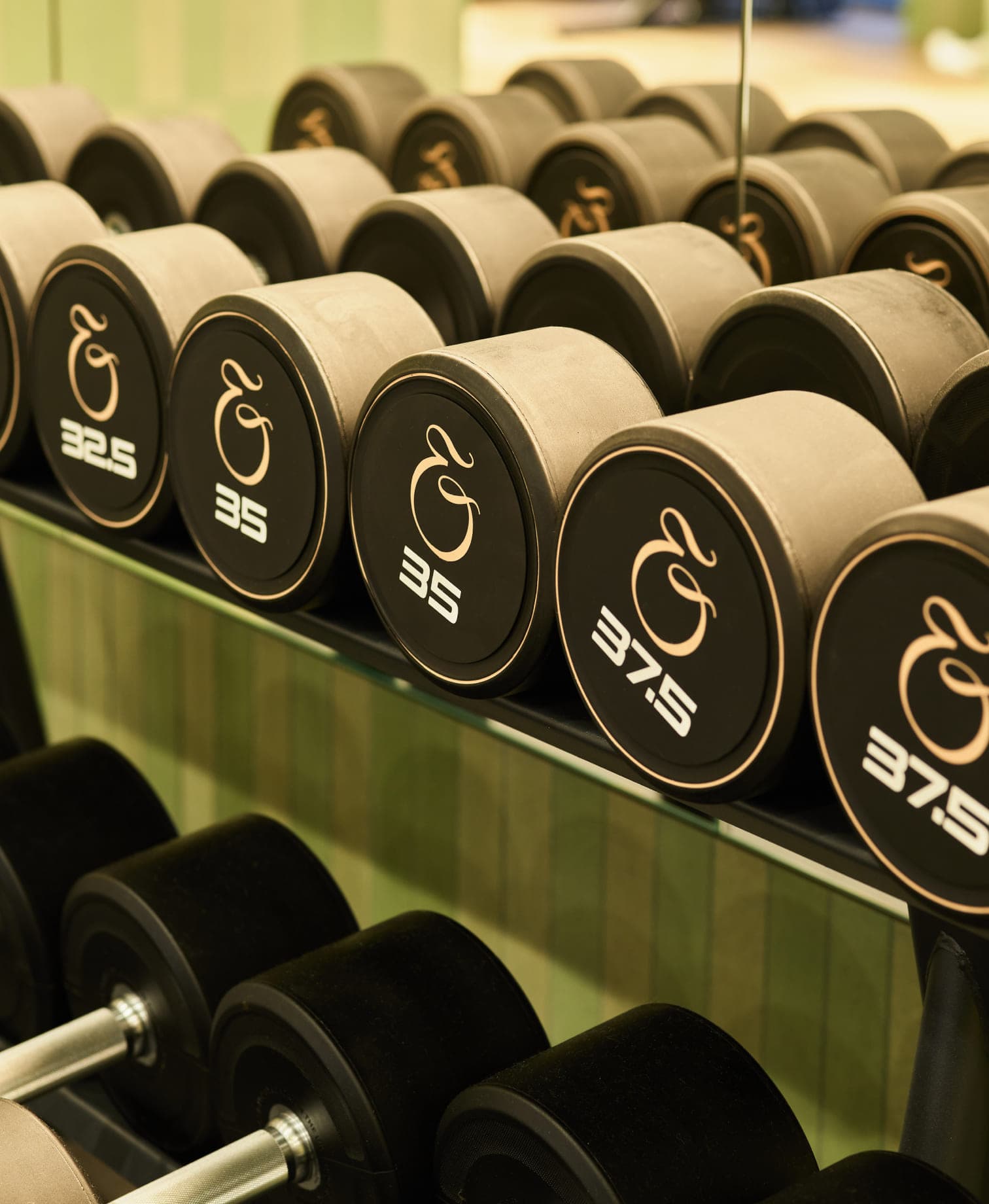
The city’s details found new expression throughout the identity. Deep reds recall its brickwork; arches echo those of the law courts; and calligraphic accents in the typography nod to Birmingham’s history of making pen nibs. Together, they give One Eastside a sense of place without holding it in the past.
02.
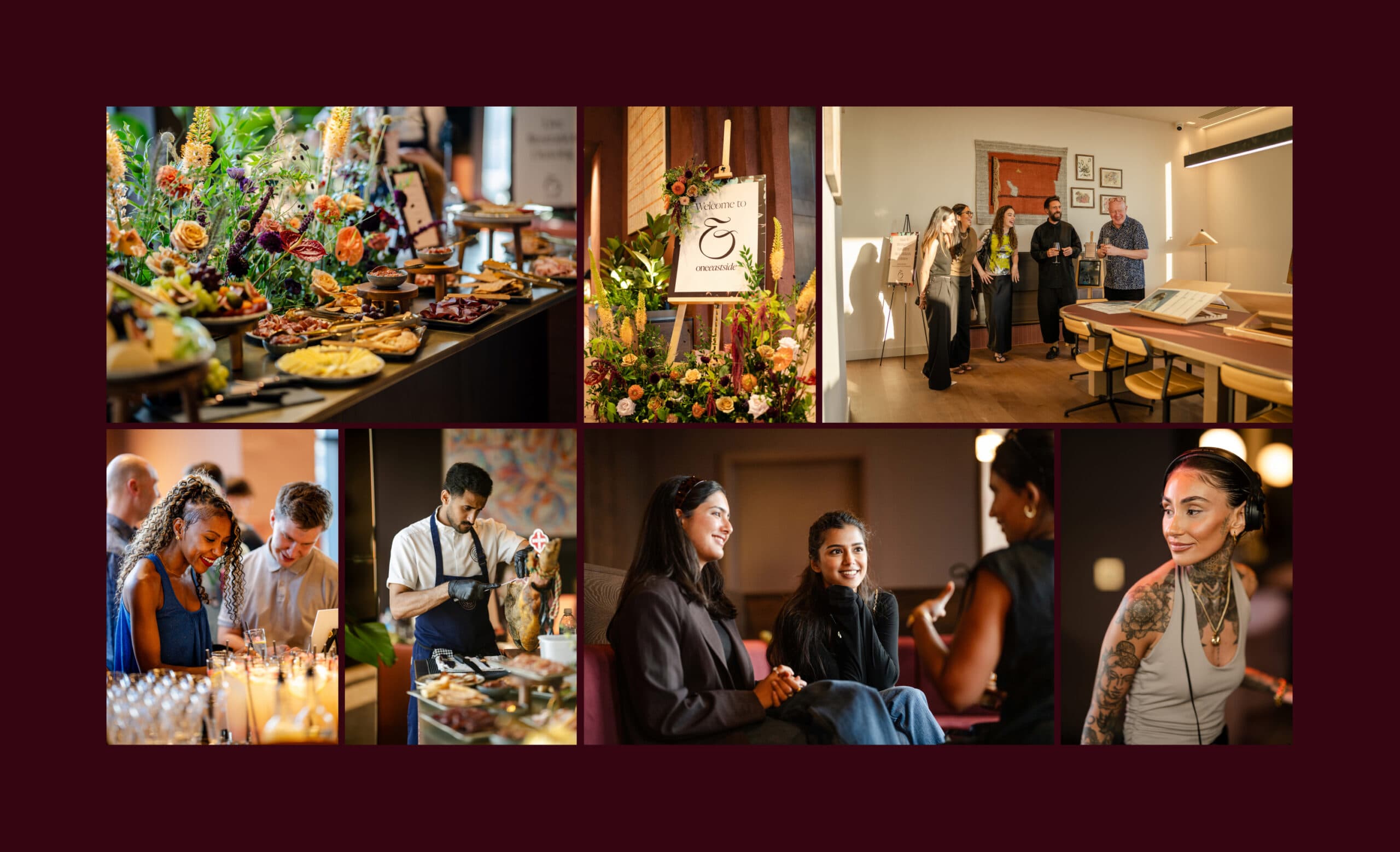
For many prospective residents, the website is their first experience of One Eastside. It opens with a sense of what life here could be, then lets them get closer: exploring the building, discovering its spaces and finding the apartments that suit them. Richer stories reveal the thinking behind the development, giving people a feel for what makes it different before they ever step inside.

03.
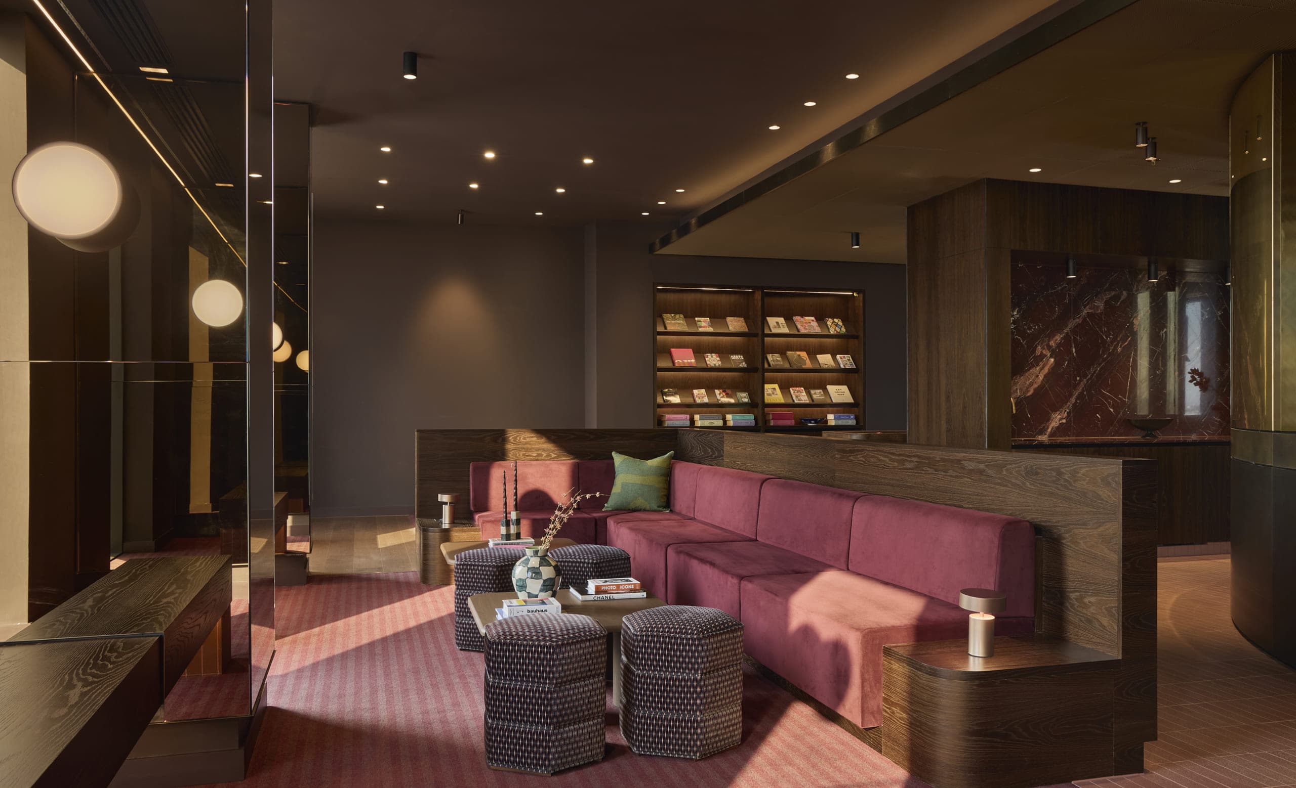
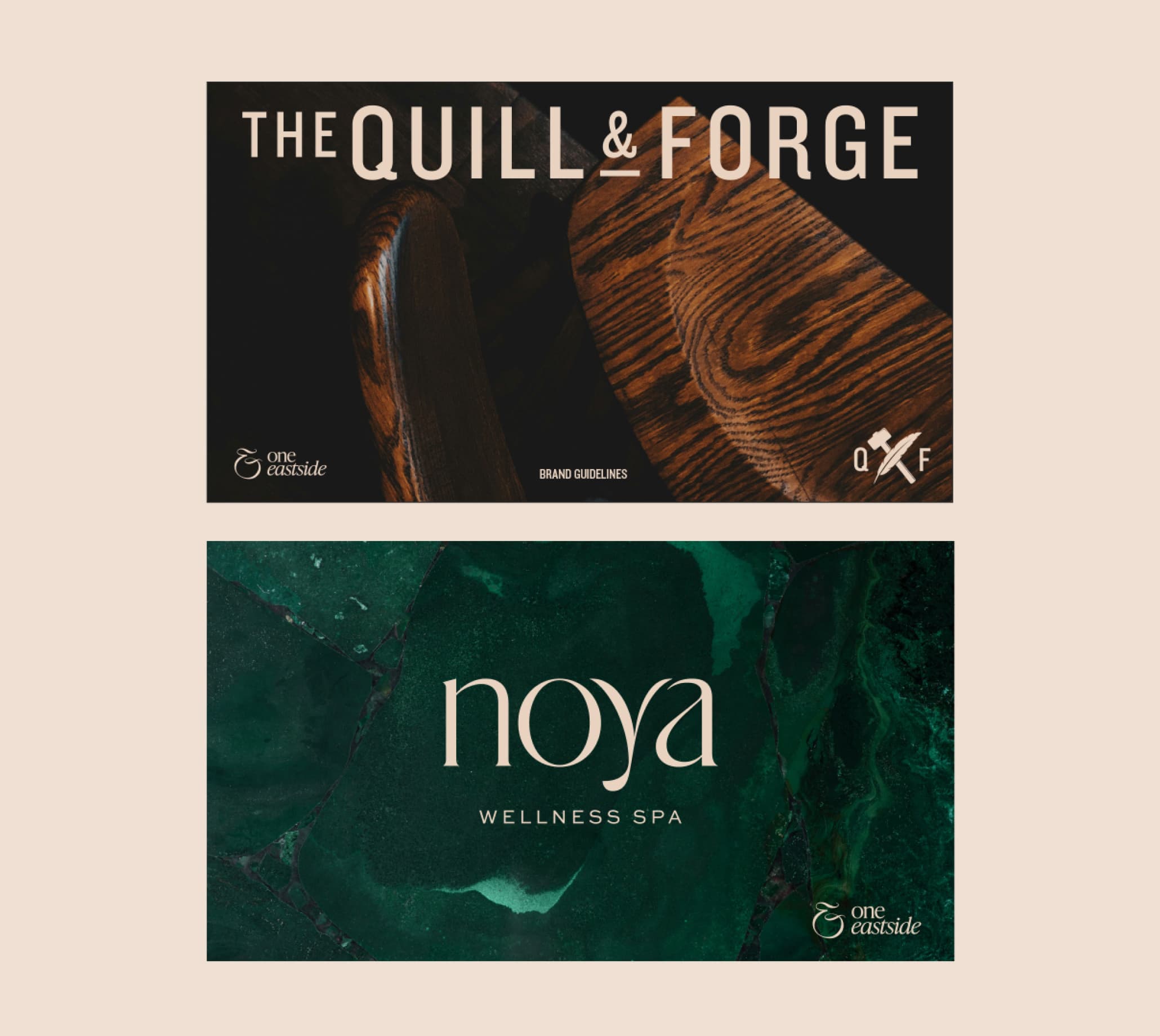
With the feel of a village within a tower, One Eastside needed to make its many spaces easy to understand and enticing to explore. We gave destinations including the Noya wellness spa and The Quill and Forge pub identities of their own. Each has a distinct personality, while remaining unmistakably part of One Eastside.

Rising above the city. Rooted in its soul
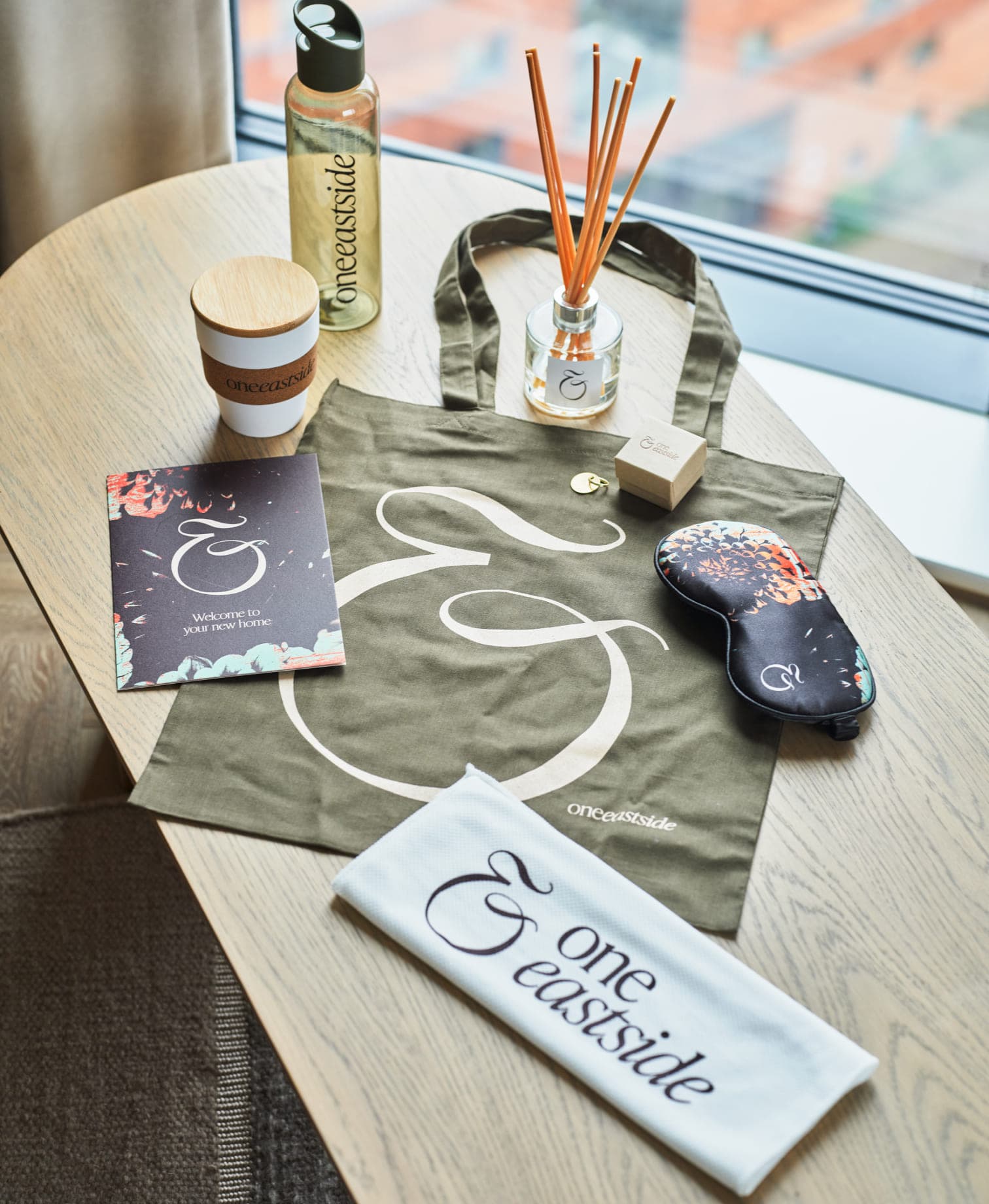
From its place on the skyline to the smallest details within, the identity gives One Eastside a story that belongs to Birmingham. It brings clarity to a broad living offer and creates a distinctive presence for the development in a busy rental market.
- 3
- Distinct brands, one connected destination
The minds behind the Matter.
We think the work speaks for itself — but the people are worth meeting too.
Visit the studio →